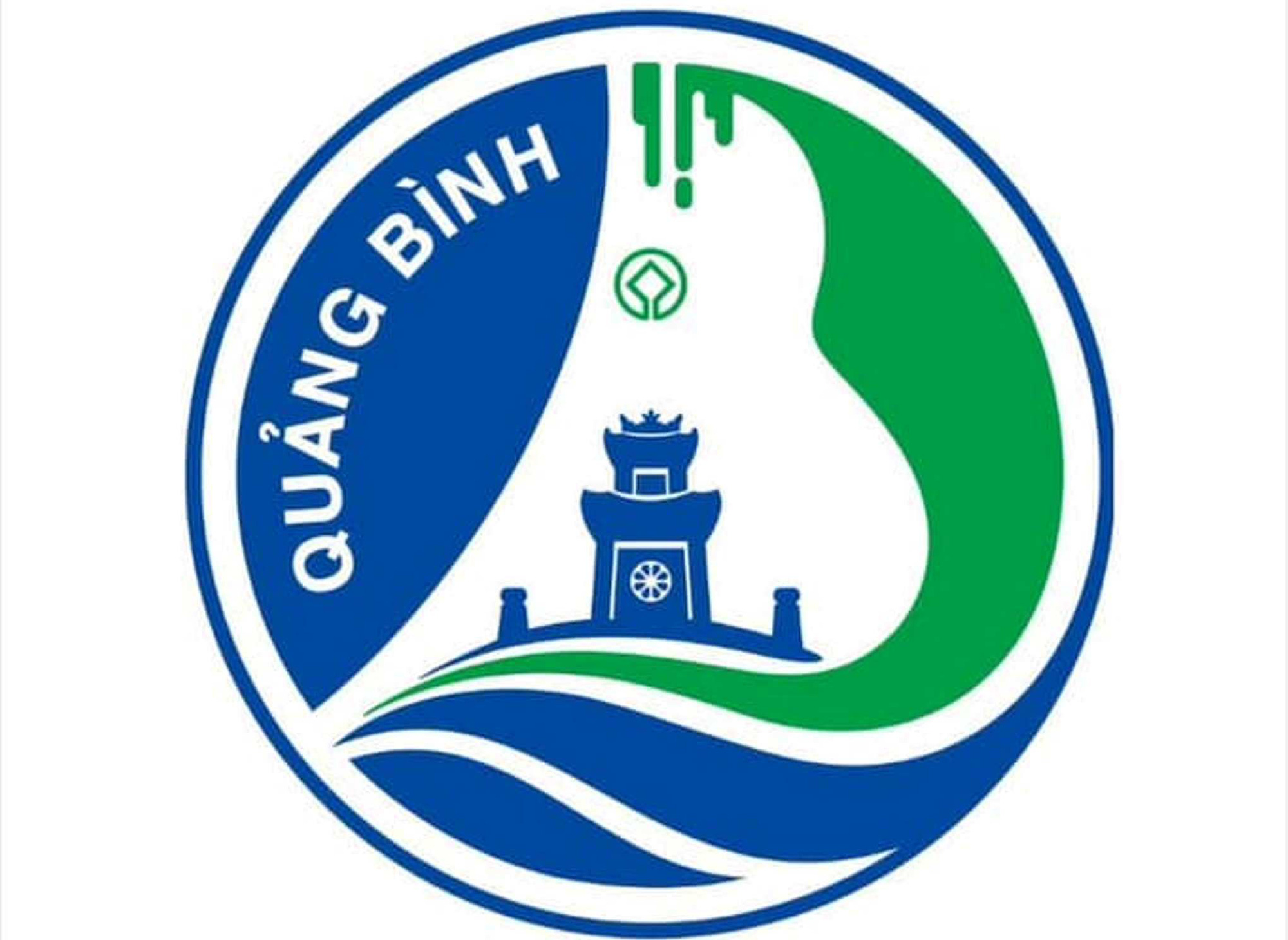
The first prize winning logo was sent back by the Department of Culture and Sports of Quang Binh - Photo: Q.NAM
On May 26, the Department of Culture and Sports of Quang Binh province confirmed that it had mistakenly sent the first prize-winning work of the province's logo design contest to media agencies.
The department then returned the official winning entry.
"Due to the negligence of the support department, the first prize winning logo was mistakenly transferred. The leaders of the Department of Culture and Sports are very sorry for this incident," the department's announcement stated.
Compared to the wrongly sent logo, the replacement logo has an additional part of the UNESCO World Heritage Committee symbol in the middle. In addition, the so-called "stalactites" are made more compact and harder.
This first prize winning logo belongs to the work with code number: BT190A (M02) by author Hoang Thi Thu Thao.
However, on social networking forums, many opinions say that these two logos are basically not much different, and disagree with this work winning first prize.
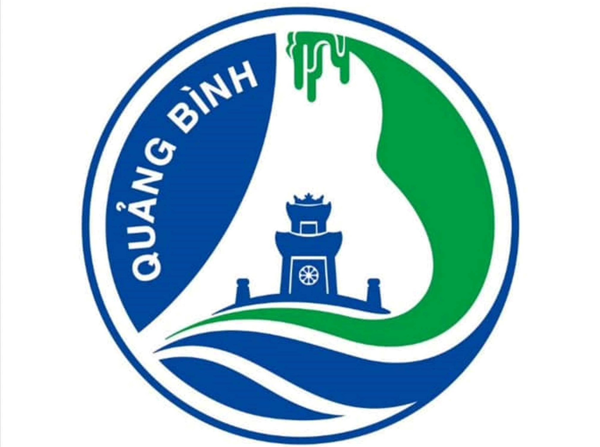
The logo was sent by mistake earlier - Photo: Q.NAM
Most opinions said that the first prize winning logo was designed in an old style, not modern, and had too many unnecessary details.
According to the explanation of this work by the Department of Culture and Sports of Quang Binh province, the overall layout of the logo is stylized with two letters Q and B (Quang Binh).
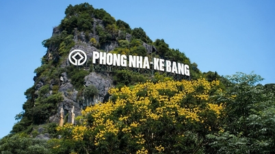
"The letter Q forms a curved line representing the Gianh River... The letter B is designed like majestic mountain ranges and caves symbolizing Phong Nha - Ke Bang National Park...
The negative space of the letter B combined with stalactites creates the magnificent beauty of Son Doong Cave, the largest cave in the world, a globally outstanding value..." - the commentary stated.
Along with that, the image of Quang Binh Quan on the logo is explained as a century-old relic with great value in terms of history and military art.
Regarding the main colors, the description mentioned blue and green.
Blue is the color of the sky and the vast ocean, representing the desire to reach out, integrate and develop globally. Green represents the land of Quang Binh with its natural and diverse ecosystem, sustainable tourism development associated with indigenous cultural features, representing the destination's mark.
Source: https://tuoitre.vn/quang-binh-gui-nham-tac-pham-dat-giai-nhat-sang-tac-logo-ban-moi-van-bi-che-20240526112006779.htm


![[Photo] Binh Trieu 1 Bridge has been completed, raised by 1.1m, and will open to traffic at the end of November.](https://vphoto.vietnam.vn/thumb/1200x675/vietnam/resource/IMAGE/2025/10/2/a6549e2a3b5848a1ba76a1ded6141fae)


















































Comment (0)